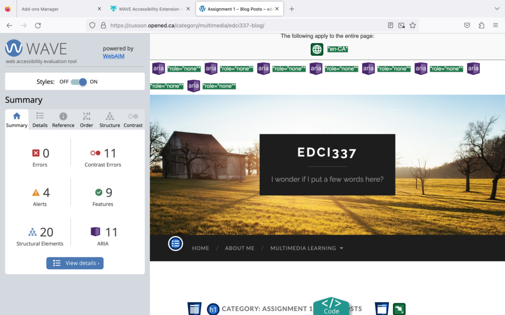
Wave
I discovered that there are a lot of identical titles on my blog while reviewing my report on wave. It gives my blog a really boring appearance.The page appears disorganized. Things that are not necessary should not be present.In the future, I’ll make an effort to reduce these issues. enhances the clarity of my papers. Cut down on heading repetition that isn’t necessary.
Canva
Canva is a new tool to me. The difference between Canva and Powerpoint would be Canva have more interesting model than Powerpoint.The information I came up with is a little intricate. It takes time to provide information. Next time, I would try to use a more clear model which can show information more straight.
Read/Watch
I try to use NaturalReader to transfer my text to voice. It feels weird to have my TEXT read aloud by a voice manufactured by software. I find it boring to read or comprehend a web page because of the created voices. Voices from people are incredibly human. If you read aloud, it would be more engaging.
Thank you for your sharing! I foud that you used Wave and Canva to show the Design Principles for Effective and Accessible Multimedia which are we learned from the lecture. Also, Using NaturalReader is a great way to let audience to understand what you are trying to explain. It’s more attractive by listening rathing than reading.